All photos by Frankie. Thanks, Frankie!
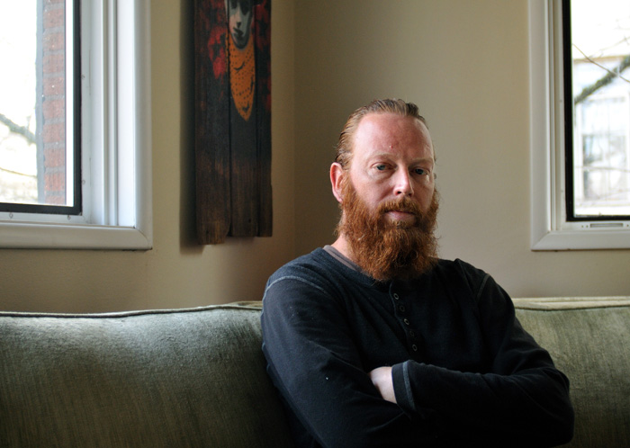
East Coast powerhouse, Philadelphia’s mayor, whatever cliché you want to call him, Ricky Oyola is still around, conducting his Traffic venture the very same way Zoo York did in its humble beginnings. And unsurprisingly, he still promotes a form of skateboarding that does not involve parachuting oneself down rails in bondage pants, nor ledges combos that require a PhD in mathematics. Just raw street skating that’s actually happening on the streets. From Zoo to Traffic, via a little Aleister Crowley-infused phase with Illuminati and Siver Star -same thing, as Dr Crowley used to refer to the illuminati as “the order of the Silver Star”- his five own favorite board graphics exude just the same thing: meaningful rawness.
 Zoo York Love (1993)
Art by Eli Morgan Gesner
This was well before anybody used this Love Park image, we were still sitting on a gold mine, it was really original at the time. It was just like EMB was, but it was over here in Philly, and it was ours.
Robert Indiana is the guy who did that statue but I didn’t give two shits who this guy was. We were Love Park, it was our second home. Which is funny, cause in Eastern Exposure I barely had any footage there. Remember, Zoo York was really small then, so the board wasn’t being sold all over the world a lot, but the people on the East Coast who bought it, they got it. Some little kid probably had no idea about it, but by this time Love Park had became known enough that a skater’s skater knew what it was.
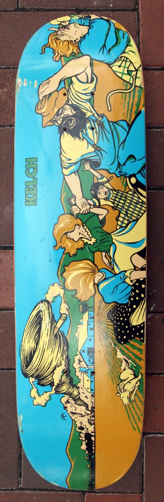
 Zoo York Hydrant (1995)
Art by Eli Morgan Gesner
They sold that Hydrant board for ever. By the time Matt Reason came in from Adrenalin, he had had maybe twenty graphics while this one was still out. I liked the fade, I liked the way my name was written. I am not sure why and how he got that photo, but it just fell in place perfectly.
(For more precisons about this very graphic, check Eli Morgan Gesner’s explanation at the end of this post…)
 Illuminati Mass Control (1996)
Art by Eli Morgan Gesner
Illuminati came about because me, Matt Reason and Serge Trudnowski were doing a lot for Zoo York and I was like, “Look man, give me an offshoot. We’re doing a lot for this brand but you’re not showing us the love.” And they did. I wasn’t into the illuminati at the time. Eli was. He created all this. The company only lasted eight months, but for the first six months, it was nothing more than a sticker. We had nothing else out. Illuminati is some of Eli’s best work. I really think he’s one of the best graphic designer that skateboarding has ever had.
We started buying books, and get involved because we knew that as the company grew, we’d be asked about it. It opened our eyes to possibilities of what happened in the past, currently, and what could possibly happen in the future. The text itself is about the controlling of the masses. It just comes from ancient pharaohs: before the drought season came, the workers were harvesting food. Then when there was no water, there was no work to do, so people would get a bit restless. To control that restlessnes, the pharaoh was basically saying, “When there’s no water, your ass is gonna go build a pyramid.” It was made in a way where they were constantly working.
I also kept this particular board for the Tony Hawk autograph. I was in Australia selling boards, it was basically a way to survive and we went there to check Tony Hawk and Mike Frazier doing a demo. And a buddy of mine took a bunch of my boards to try and sell them, there were kids all over the place, so what happened is that Tony Hawk is signing like crazy, he just grabbed the board and signed it. My buddy came back, he was kinda chuckling. But I said, “I’m not selling this board. I just won’t eat for a couple days.”
 Silver Star Faces Of The Globe (1998)
Art by JB
There was this really old Masonic certificate framed in an antique store on South Street in Philly. Matt Reason saw it and wanted to get it. He didn’t make much money then, I was making some money, basically I went to the store and bought it for fifty bucks for him to have it as a graphic. But he and I started having our differences I suppose, he kinda started being distant from all of us, this is when he was getting sick and stuff. Really, again, originally I bought for him to have a graphic for it. But we were growing apart, and this was just the beginning of it.
Originally it said, “to all free and accepted Masons,” we changed it to “skaters”, and on the side it said, “faces of the globe.” That thing was as big as a window, we only used the very top of it. I saved that print for as long as I could but when my daughter was two years old, she destroyed it. I was very stunned when she did it, but it was really thin paper, it’d just flake off if you touched it. I never got it authenticated but I’m almost 100% sure that that thing was fucking old, old, old.
 Traffic Rocky (2005)
Art by Mike Stein and Julius Reeves
We went to shoot the photo and when we put together the graphic, we wanted to base it off the Zoo York Hydrant board, with the fade. Mike is a big Rocky fan, he had a Rocky poster in his room, that’s basically the idea. And Ricky/Rocky is the same, plus the Zoo guys used to call me Balboa cause I was from Philly and, you know, I had an attitude. This board has a lot of meaning cause Rocky might be a made up character, he’s very history, very blue collar, very Philadelphia. So that’s why this board keeps going. It’s just there, it has so much meaning and makes so much sense for it to be my board.
Extra ball: the Eli Morgan Gesner email showdown
Whoever has ever spoken to designer/jack of every single trade Eli Morgan Gesner knows that passion oozes out of him in the form or long, intricate, amazingly on point, emails. Below is the exact transcription of what he had to say when I asked him “a precision or two” about the boards above. I’d suggest you take some time off, and enjoy, as much as I did!
1. The ‘LOVE’ board
This is one of our very first boards. At ‘Zoo York’ we had a phrase for a graphic like this. ‘A Lay Up’. As in it’s just too obvious and too easy not to do it. Any ‘Zoo York’ graphic that was like the Yankees, or the NYPD, or a Taxi, or the Subway signage stuff. Those helped us make a name for ‘Zoo’ but they were all no-brainer Lay Ups. Especially just the straight graphic rip offs. Duh!
Obviously, he’s fucking Ricky Oyola. How were we NOT gonna make the Love Park ‘LOVE’ board? I drew it by eye in Illustrator from photos of the sculpture. I guess I could have found the original art by Robert Indiana, but this was a LONG time ago and that would have required me to go hunting around Book Shops and Reference Libraries. The internet was not helpful for things like that back then. Drawing it myself was way easier. Also, we were literally making all the graphics by hand. I had to go to a ‘service bureau’ (which was a computer / film laboratory that would do all your CMYK / spot color film separations back in the day. Before you could do everything in your bed room!) They made the films, we burned the screens, and had to silk screen everything. Ricky Oyola (My old team mate by the way. We both used to skate for Z-Boyz) is a LEGEND of the highest caliber, and although this board is conceptually obvious to me, it’s a classic representative of a classic.
2) The ‘Fire Hydrant’ board
Fuck! I wish I still had this whole series. This was my first real conceptual graphic pro-series for ‘Zoo York’. I did these around 1995, maybe a little earlier. Up until then, we were just sort of setting up Zoo York. So most of the graphics we’re hit-em-over-the-head we’re Zoo York from New York City graphics. Lay ups! But once people got the idea I felt I could start branching out and being more creative and conceptual. One thing about me, I have a massive collection of rare and out-of-print photo book of New York City. One that I cherish is a book called ‘The Block’ by Herb Goro. It’s sort of a year long photo journalistic report on one single block in the poverty stricken South Bronx in the 1970’s. We follow all sorts of characters on the block and their good times and bad. It’s really, really important to me as an artist. On so many levels. Especially because it reminds me of my own childhood in way-less-horrible Manhattan.
One of the main things that struck me were all the photos that Goro took of these kids living in abject poverty but still finding things to play on and have fun with. Honestly, these images are the embodiment of the triumph of the human spirit. The greatness of man. This massive, hard, dangerous, inhuman world crushing down from all directions and these kids shine through, having fun, being free and creative, unaffected. Really, everything that pre-21st century skatepark-utopia street skating was about. I HAD to jack these images. I had to share them with the world. So, we did this ‘city kid’ series. The kid jumping between buildings for Frank Natiello, Gangemi got the kids hanging on the back of the elevated train, and Ricky got this Black kid spraying water out of a Fire Plug. I love these boards and they are some of my favorite work, in any discipline.
There’s a saying that goes ‘I was too young and stupid to know any better’. Frequently, this is when a lot of great work get’s done. This holds true to these boards, and Ricky’s in particular. The most disappointing thing about these boards is that, frankly, we didn’t really know how to screen skateboards back then. The images Goro took are sublime and nuanced black and white photos.

And I tried to do the images justice, and even though the films I produced were close to the original photos, the actual burned silk screens and subsequent screening of the boards didn’t work so good. Gangemmi’s board came out pretty good, as did Natiello’s, but Ricky’s, I think because the image had to be screened onto the tail, didn’t translate to my satisfaction. Plus, the foggy water spray is just tough to begin with. The technique of being able to silk screen over the kick nose and tail were a closely guarded secret in California. Rodney Smith and I, at one point, tried to trick the guys at World Industry into showing us their board screening room, but they saw right through us and took us out for drinks instead. Haha!
All we had was us over here in New York. Greg Chapman ran our wood mill that he and Rodney Smith had started up. So Greg was off in Long Island trying to figure out how to make skateboards. It was very grass-roots and very trial and error. BUT! As you might remember, all of us at Zoo York we’re very into Eastern Philosophy and Military Strategy. And one of the principles of Guerilla Warfare is that your weakness is also your greatest advantage. And you’re advantage, you’re greatest weakness. Napoleon took over the world with one of the biggest Armies in history, but he had to stop simply because he couldn’t feed all those soldiers. Inversely, 2 snipers can take out an entire battalion simply because they can move faster and quieter and are harder to find. So, we realized that we we’re smaller than the West Coast skateboard factories and that we were producing fewer boards. But! That meant that we could spend more time on each board. So, Chappy got into hand air-brushing each board. So, out of nowhere, Zoo York suddenly had the only boards with these unique, hand done, color fades. We were the only ones. And then the West Coast companies were asking us ‘How do you do that!’ Haha! That’s our secret! On occasion, Chappy would go a little out-of-control with his painting, suddenly switching up colors and fade-schemes without telling us, but for the most part, the spray fades we’re tasteful (the mauve and baby blue example you have for Ricky Oyola’s board is not only gorgeous, I have never seen that color way until now! Haha!) In the end, differentiation is key to succeeding in any field. The ability to stand out from the herd and be unique is always key. And the spray fades did that for us.
Believe it or not, ‘The Block’ was such an important book to all of us at Zoo that we actually tried to reach out and ask permission for the usage of the images, like we did with Horst Hamann and his book ‘New York Vertical’, but for the life of us, we could not find Mr. Goro or the Publisher. They had all vanished. To this day I would love to tell Mr. Goro what an effect he had on all of us, and in turn, many skaters across the world. But he is no where to be found. Regardless, I strongly urge everyone to find a used copy of ‘The Block’ and give it a read it’s deeply inspiring and deadly tragic. (One of my favorite images is of a father, crying on his knees, over the body of his dead son. His son had fallen off the back of the elevated Subway, as in Gangemi’s board, all the way down to the street. Powerful stuff.)
We were very fortunate in a lot of ways over at the old, original Zoo York. We had good graphic ideas, our own home-made wood mill, and the greatest city in the world to take from. But honestly, perhaps our greatest advantage was that we had Ricky Oyola riding for us and supporting what we were trying to do from the start. I can’t say enough nice things about him. He’s a true legend.
4. Illuminati “Mass Control” (& Silver Star in general -Seb’s note)
)To be as forthcoming as possible, I had always had an interest in the idea of the ‘Illuminati’ – Not per say specifically Freemasonry or what one might read in Dan Brown’s novel ‘Angels & Demons’ (or the Tom Hanks / Ron Howard movie of the same name) but more so in the ghostly idea of ‘control over the masses’ and how this has been achieved over the eons, from the ancient Egyptians all the way through to modern day entities like the Builderberg Group. Anyway, I know about this sort of thing.
We hit a critical mass at Zoo, where we wanted to expand and were not sure whether to just focus on growing Zoo into a clothing brand or ‘diversify’ and create more skate brands (like ‘World Industry’ or ‘Deluxe’). Oyola and all of us at Zoo decided it would be best to create our first ‘spin-off’ brand for Ricky. I had told him before about the ‘illuminati’ and ‘the Freemasons’ and specifically their involvement in helping to create The United States of America. If you understand Freemasonry, there are endless examples of their influence in America, from the usage of copper that ultimately lead to the creation of the ‘middle class’ (long story) all the way through to the famously iconic ‘eye of the pyramid’ on our U.S. one dollar bill. Ricky was always fascinated by this and felt a connection to it being from Philadelphia, the birthplace of our Nation. So we went with that.
I have to say, in retrospect I might have gone conceptually overboard with Illuminati. I’d like to hope not. It actually deeply saddens me that at one time, skaters would respond to such intelligent ideas as the things we used to do with Illuminati, and in the end ‘Jackass’ and ‘Rob and Big’s Fun Factory’ won out… True irony! ;)
I think at one point we were leaving mysterious instructions in advertisements for kids to do papers and reports about various things ‘illuminati’. To have the kids learn for themselves how the powers that be manipulate them and distract them from the truth. And we actually got some reports! I was surprised and impressed. If any of you kids (men now) who sent those reports in are reading this, I can never express how effected I was by that. I cherish them to this day. Any way… I digress.
The Illuminati ‘Akhenaten’ board was Ricky’s because Akhenaten (or Amenhotep IV) is arguably the first step in modern populace control. He was a very mysterious figure and some even claimed him to be an Alien because of the unique way his head was drawn. He is important because he was the first ruler to adopt a monotheistic religion, abandoning the traditional Egyptian Polytheistic Gods for ONE true God, the Sun. After Akhenaten’s death however, his successors returned Egypt back to their traditional polytheistic religion. Some believe, Sigmund Freud most notably, that Moses was actually an Atenist priest forced to leave Egypt after Akhenaten’s death. Who knows…
Anyway, I can’t for the life of me read what I wrote in that chunk of text, but I’m sure it was something close to what one would find in WikiPedia now-a-days. That shit didn’t exist back then. It might have also included an explanation as to the relevance of the Egyptian Pyramids for the United States as well as the Egyptians. But you’re gonna have to look that up for yourselves from now on. I’ve already said too much.
In the end, we were hit with a ‘cease and desist’ order from the crappy, nerd-a-rific playing card game ‘Illuminati’. Turns out that ‘games and sporting goods’ exist in the same copyright and trademark sector in the United States. So Dungeons and Dragons is considered nearly the same as the NFL, according to our Government. Imagine that.
We had to close Illuminati and Oyola left us to go run with the same idea, now spun into the name ‘Silver Star’. Although in his defense, ‘Silver Star’ was pretty much all about Freemasonry. Hey! Do you guys know if Ricky became a Freemason? He’s a perfect candidate! That would be awesome! Anyway, It was kind of shitty that all that went down and to this day I still get ‘Why did you guys kill Illuminati? It was rad!’ Well, it wasn’t us, friend. We were forced out by the card game. Or were we?… I suspect that there was a deeper, darker conspiracy at work! We get all the kids to start asking questions and THEN ‘Jackass’ gets picked up by MTV? Coincidence? I think not!


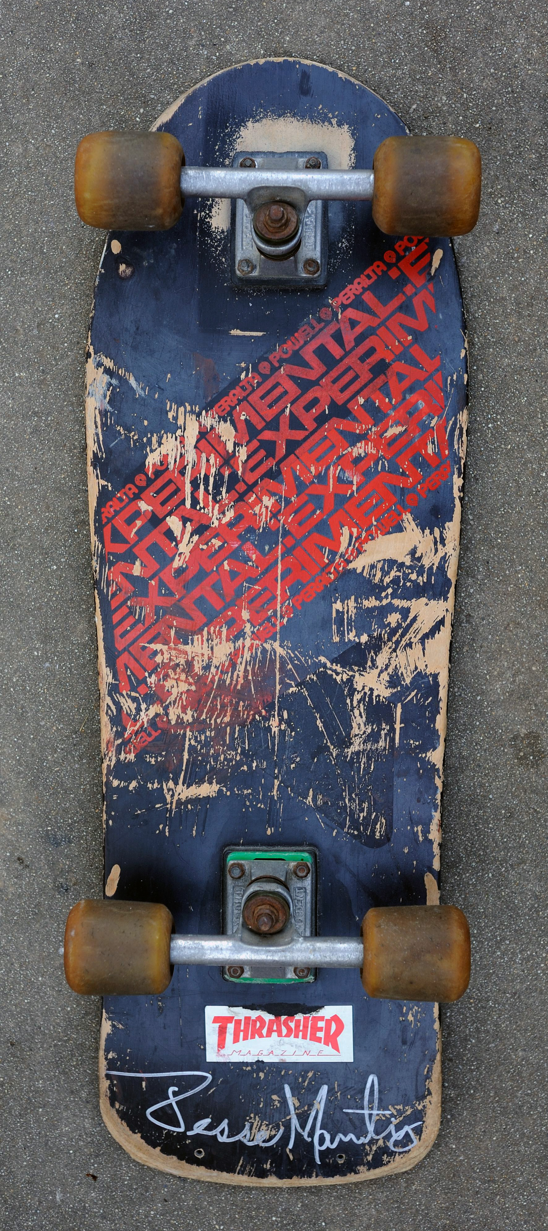 Powell Peralta Experimental (1986)
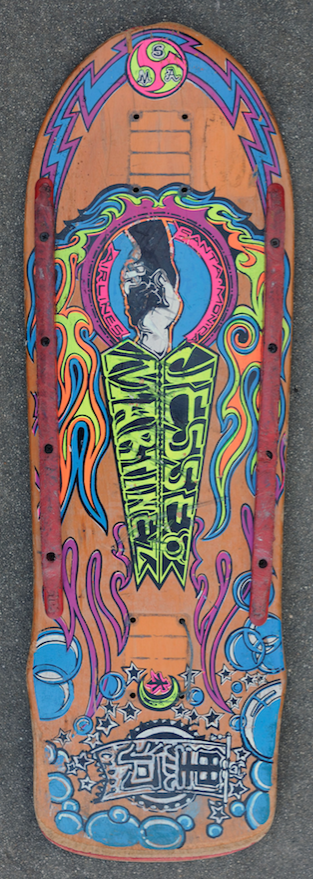 SMA Handshake (1988)
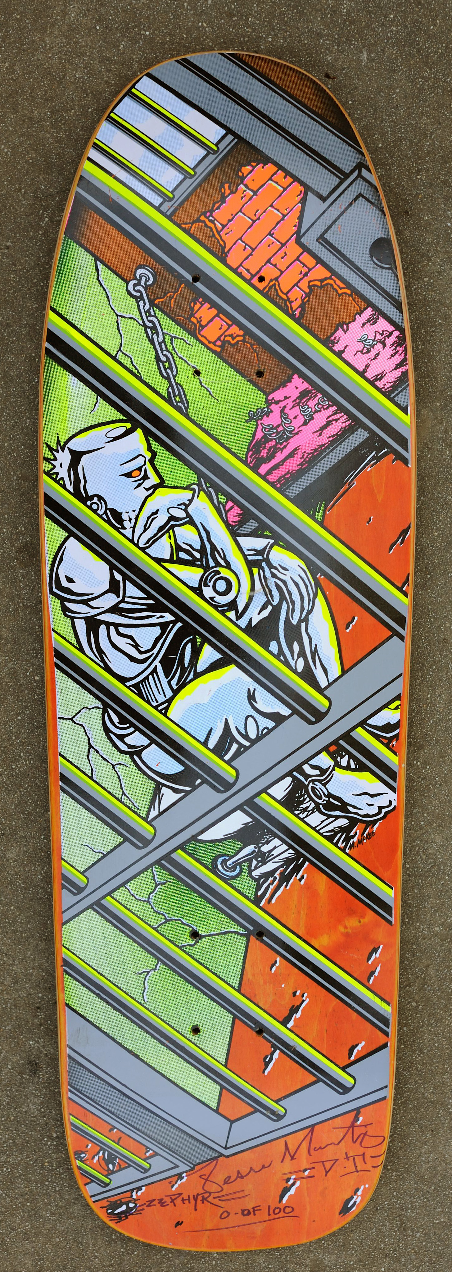 World Industries Jailed Robot (1991)
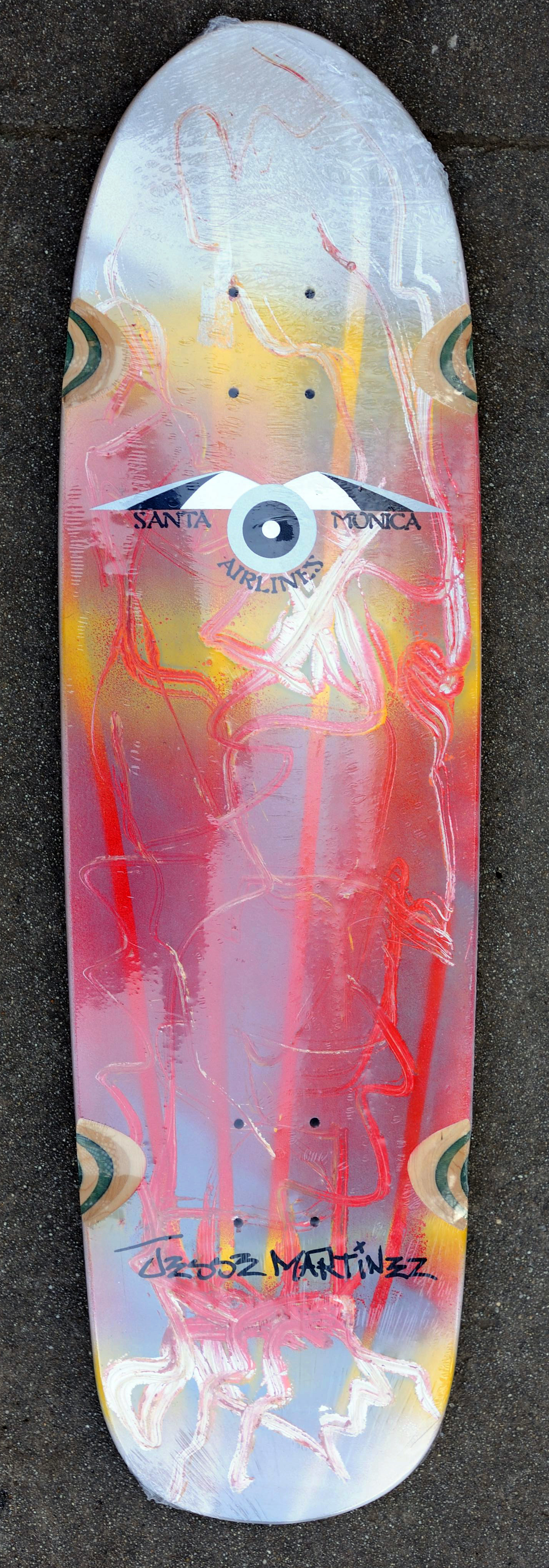 SMA one-off (2005)
 Powell one-off (2012)